© Turkuvaz Haberleşme ve Yayıncılık 2024
Among the La Brea Tar Pits and Los Angeles County Museum of Art (LACMA), a new star rises to celebrate the art and science of film while also bravely addressing its turbulent history.
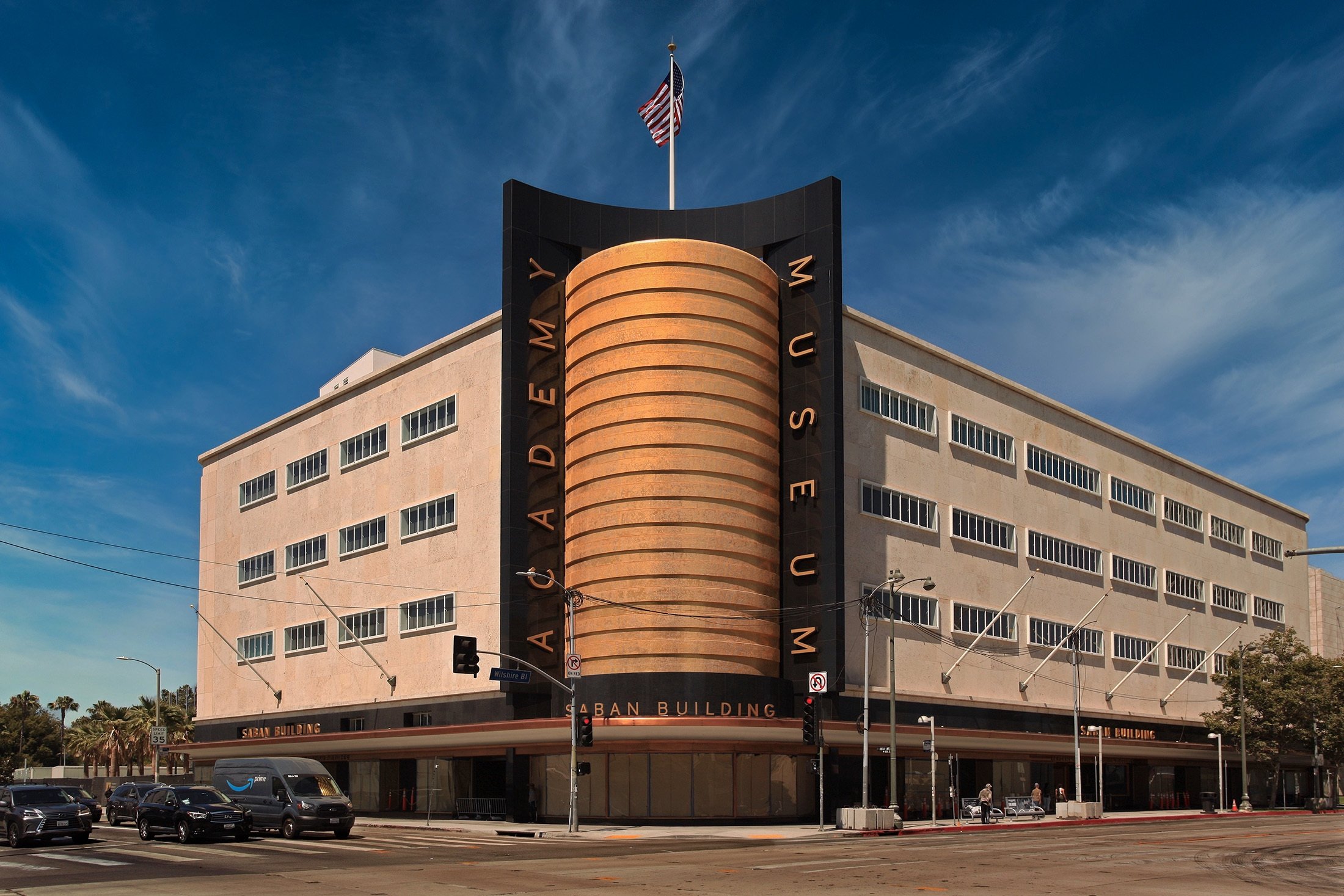
Materializing like a futurist zeppelin between rows of quaint Spanish Revival homes, the Academy Museum of Motion Pictures has finally landed, adding an unmistakable silhouette to the landscape of Los Angeles.
Its most dramatic feature: the new David Geffen Theater, a spherical building inspired by the dirigibles that used to touch down in the area in the early 20th century when the Miracle Mile was an unmiraculous lane and the land around Wilshire and Fairfax was an airfield.
In addition to dropping a space-age, 1,000-seat theater on Fairfax, the museum project, led by Italian architect Renzo Piano, has also beautifully preserved the old May Co. department store building to which the theater is connected – and that is truly excellent news.

After May Co. shuttered the store in the 1990s, the building languished. But the team at Renzo Piano Building Workshop, Piano's namesake architectural studio, has given this handsome structure new life. In combination with the brash new Geffen Theater, the architect has remade the western edge of a blocks-long cultural complex that also includes the La Brea Tar Pits & Museum, as well as LACMA where he designed two other buildings: the Broad Contemporary Art Museum and the Resnick Pavilion.
This is no run-of-the-mill renovation and expansion.
The Geffen Theater – known colloquially as "the Death Star" – is absolutely inescapable. Its circular form is visible from the ramps of LACMA's Pavilion for Japanese Art and over the sawtooth roof of the Resnick. Even if you leave the LACMA-Academy Museum complex to visit the independent art galleries a block west at 6150 Wilshire, well, the Death Star will follow you there too. You can see it peering at you from the second story of gallery 1301PE.
A little background is necessary to have an insight into the building of the Death Star. And for that, we'll need to go back to the May Co. building, which was dubbed "the Store of Tomorrow" when it opened.
In 1994, LACMA picked the building up at fire-sale prices – $18.3 million, to be exact. But due to a lack of resources, it employed the structure only half-heartedly, frequently subletting portions to other institutions.
But in 2012 the Academy of Motion Pictures took over the May Co. building as part of a long-term lease arrangement with LACMA. The completed project on the building by Piano – which comes as LACMA is still trying to excavate foundations for its new building – feels like the dramatic denouement in a starchitectural poker movie: I'll see your biomorphic blob and raise you a Death Star!
Originally, the Academy had hoped to place its museum on Sunset Boulevard near the 101 freeway, in a building designed by French architect Christian de Portzamparc. That plan also fell victim to the 2008 recession, and by 2012, the Academy had settled on the May Co. site instead, with Piano as the architect.
In the early years, Zoltan Pali of Studio Pali Fekete Architects (who stylishly transformed the Beverly Hills Post Office into the Wallis Annenberg Center for the Performing Arts in 2013), was also involved. But he left in 2014 amid rumors of tension with Piano – though his name remains in the credits as contributing to the museum's concept design.
The global firm Gensler later came on board as executive architect, and the project was helmed on its end by Richard Stoner and David Pakshong.

The May Co. building, now reborn as the Saban Building, is back from the brink with an architectural makeover that has left it looking sleek and updated – to the point that LACMA may deeply regret that it let the building slip from its grasp.
Indoors, Piano stripped the building (which had undergone piecemeal renovations over the years) down to the basics: its concrete floor plates and the board-formed concrete columns. Escalators were relocated to the north side, stacked along the facade where the 1946 extension had once stood. That facade has since been replaced by a glass curtain wall, which admits daylight into the previously dim building and serves as a point of visual and physical connection to the Geffen Theater orb.
Around the escalators, slabs of floor plate have been removed, creating an industrial atrium that succeeds in drawing light down to the basement, where an education space and a separate screening room, the 288-seat Ted Mann Theater, are located. The atrium area offers a programmatic break from the dimly lit movie galleries.
It's also a great location to display Bruce, the fiberglass shark from "Jaws." The May Co. remodel reflects Piano's interest in revealing the function of structures.
Concrete columns and floors show their patches and repairs, evidence of the building's past lives. To avoid monotony – it's a 250,000 square-foot structure, after all – color is deployed in strategic ways. Gold mosaic tile adds sparkly drama to the fifth-floor restrooms. In the Mann Theater, velvety seats are upholstered in a brilliant shade of Kelly green (a nod to the green felt tip pens that Piano uses to sketch out his ideas).

In other places, there are tones more familiar to Hollywood: namely, red-carpet red. The mezzanine is swathed in it. In addition, the interiors of the Geffen Theater are a blazing womb of ruby red, with red carpet, red walls, red seats, even a red ceiling. This will be a decadent place to see a movie. Just don't wear red.
By and large, however, Piano has shown restraint, leaving the May Co. building's interiors spare so that the Academy Museum's curators can deploy them as they see fit.
As a result, the museum's exhibition designers – the L.A.-based firm WHY, founded by Kulapat Yantrasast – had plenty of flexibility for creating installations within that space.
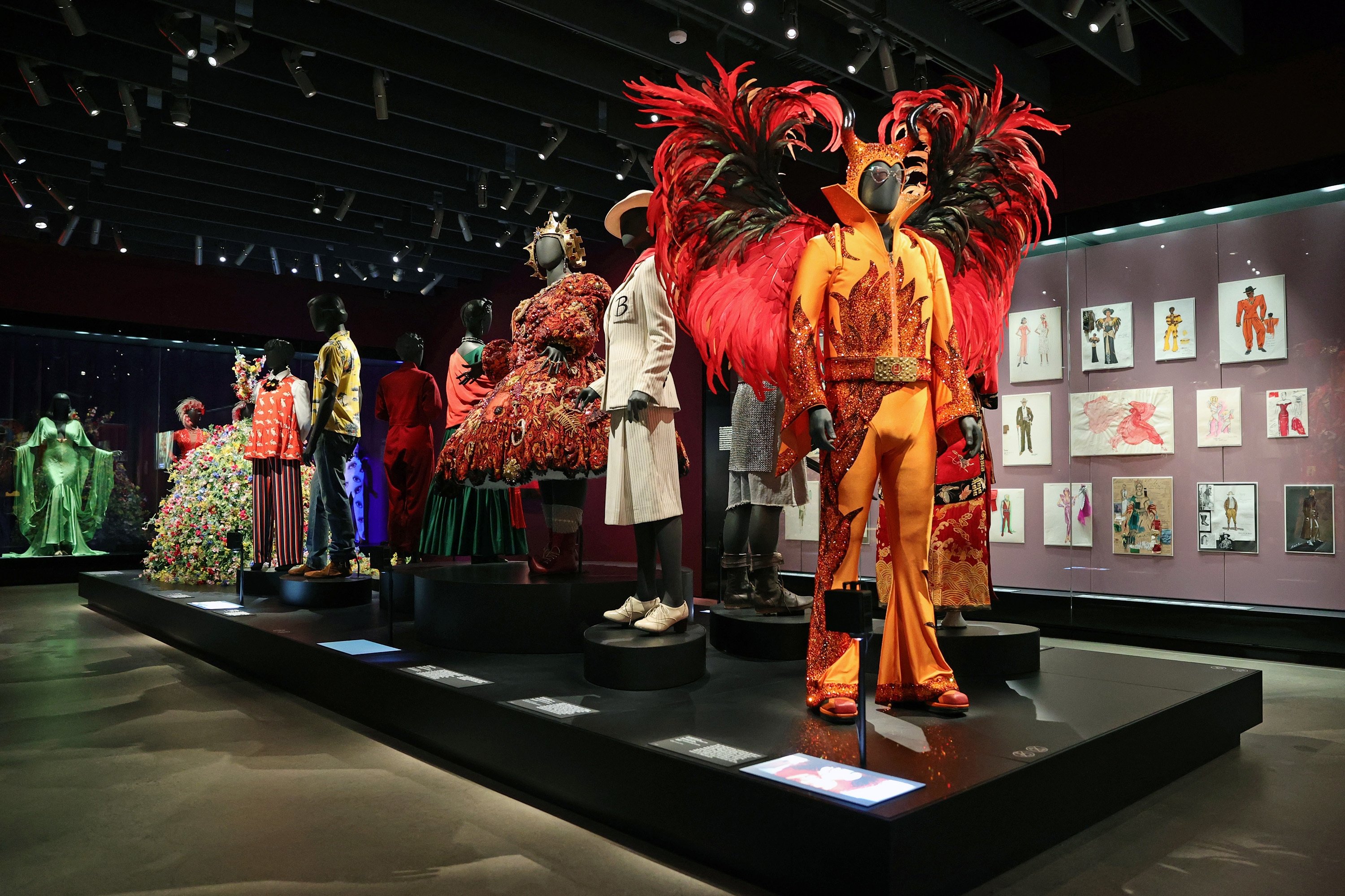
They needed all the flexibility they could get, since designing installations for a movie museum is no walk in the park: movie clips beg for a dark room, objects demand light, sound bleeds. But the designers at WHY have managed to tame these unruly, often contradictory demands, creating environments where visitors can experience the various facets of cinema without being overwhelmed.
A large gallery full of film clips might lead to a quieter environment bearing animation tools that might lead to a small space featuring storyboards. Light is adjusted gradually from one space to the next to allow the eye to do the same. Sound is piped in through elliptical speakers to prevent cacophony. In some of the object galleries, the polished concrete floors are left as is; in others, carpet is deployed to absorb sound, give the body a rest from hard surfaces or add a vital splash of color.

A large gallery devoted to Academy Awards history, for example, transitions to a smaller space bearing objects that inspire filmmaker Spike Lee. Designed to look like a Postmodern stoop, it is painted in the types of saturated hues favored by the director. It stops you in your tracks.
These bold transitions keep the experience of navigating the museum fresh. "It discourages passive looking," says WHY's Brian Butterfield, director of the studio's museum design workshop. "As you go through a threshold, you have to stop and say, this is a different type of looking and a different type of narrative."
In other rooms, the exhibition designers pay tribute to the architecture of the building, with display cases designed to mimic the geometries of the building's columns.
Despite all interior design and curation and the celebration of the May Co. building as a fine work of adaptive reuse, what will ultimately define the Academy Museum is still its spherical theater, which attaches to the north face of the building via series of bridges, one of which is lined with red carpet.
